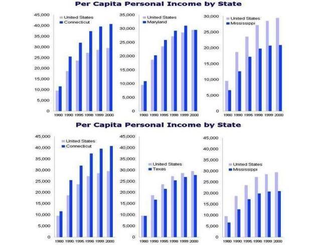
Common scales
facilitate comparison of multiple datasets.
The three graphs on top show State data relative to their U.S. average.
However, the States cannot be compared easily to each other.
The three graphs on the bottom were redrawn with the same scale so that
State data could be compared with each other as well as the U.S. average.