Go to Previous Slide
prev slide

Click here for next slide
next slide

Example supplied by Dr. Robert P. Yerex, Ph.D., MBA Chief Economist, Kronos
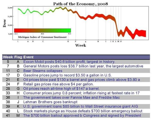
 Incorporated
www.kronos.com

I use Tufte style graphs in many of the reports I produce for our clients. This is a sample of fairly simple one. It shows the path of the economy in 2008.

· Path of the line follows the Dow Jones Industrial Average
· The width of the line represents the Unemployment Rate over that period of time
· The color of the line is indexed to the University of Michigan Index of Consumer Sentiment
· The Y shows the levels of the Dow
· The X axis has coded event points which relate to the table

SOURCE: The source code is in a Mathematica Notebook which also includes the data.
It can be downloaded here in case anyone wants to use it to get a jump start on building this kind of graphic.