|
|
|
 next slide |


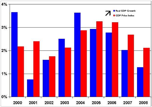
The frame around the legend has been removed
giving the chart a cleaner appearance.
What else could be improved?
The legend has a vertical arrangement with Blue bars for real GDP Growth on top
and Red bars for the GDP Price Index below
while the bars in the chart are arranged horizontally